
One of the questions I hear the most is…”So what is French country style?” I like to think of it as farmhouse glam. You use rusty, chippy old pieces with glitzy, gilded mirrors and such to give your home an elegant but homey feel. Historically, the style originated with Louis XIV’s renovation of his palace in Versailles. From there came a trickle down effect: the wealthy then imitated his over the top style, and the middle and lower classes copied the look as best they could afford to. These provinicial people (country folk) used cotton and linen fabrics instead of silks, painted their furniture and mirrors to look like it was gilded (covered in gold leaf), and made everything more ornate. Here’s how you can achieve this timeless look:
1. Choose warm, subtle colors for your background.
The dominant color in your home should be pretty neutral, so choose colors that are warm and muted – such as beige, cream, ivory, white, grey, brown and natural wood. Using neutrals for your walls, floors, and large, expensive furniture pieces also gives you the ability to have a timeless décor. You simply change your small, inexpensive items like pillows, lamps, and accessories to give you pops of color and a whole new look without spending a lot of money.
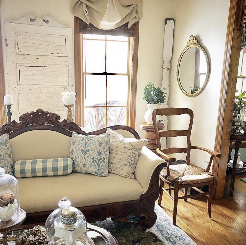
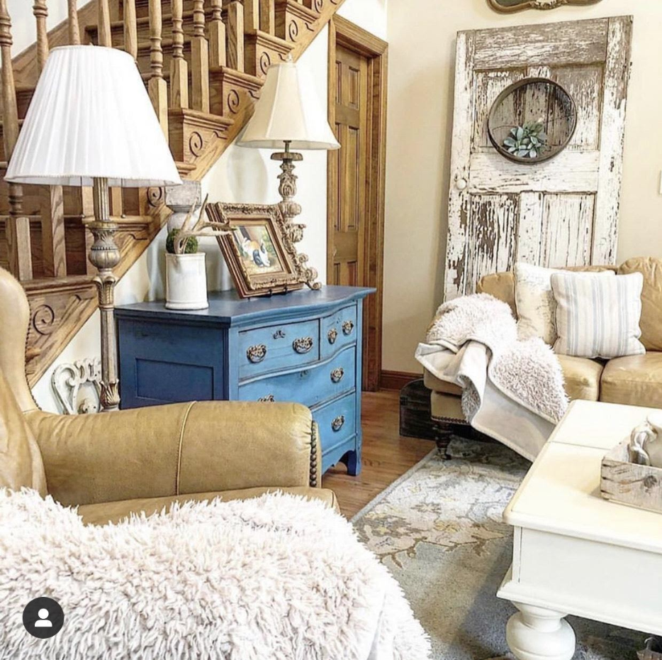
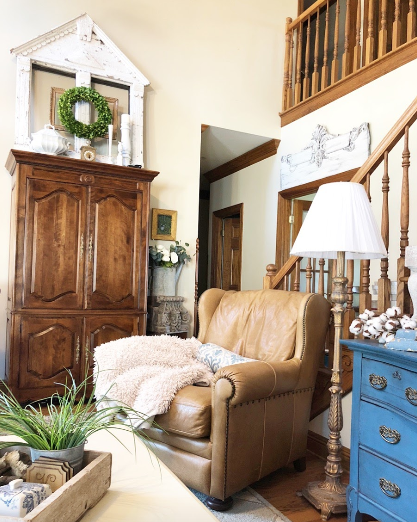
Though the foundational color is neutral, stronger color can be used to accent and add character. I love color but only in small doses. Neutrals and tone on tone are peaceful and calming, which makes a home feel restful and cozy. So adding the pop of blue from this chest of drawers really stands out against the neutral walls and other neutral furniture pieces without disrupting the calm feel of the room.
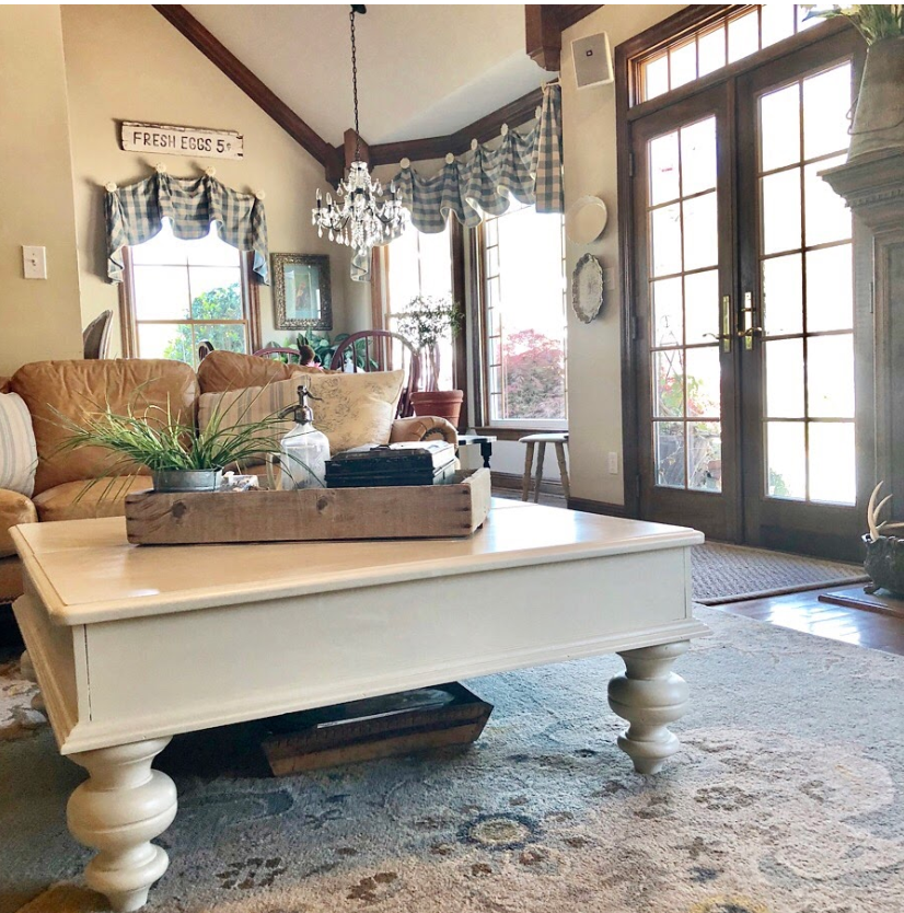
Using a neutral color theme also allows you to move pieces around your home to get a new look for free! I call this “shopping the house,” and it is wonderful to freshen up your décor for no cost at all. Since both of these rooms have the same neutral background and the same blue accent colors, I can swap the rugs, the pillows, and the accessories between rooms to achieve a totally new look for free!
2. Layer Semi neutrals in for interest.
So let’s dig a little deeper into the color wheel, so we can talk about “semi neutrals.” Colors placed on the outside of the circle are pure, bright colors. An example of this is my bright blue chest of drawers. Colors directly opposite each other on the color wheel are complementary colors, meaning each of them compliments the other. As a color’s complement is mixed with it, it will begin to gray the color, producing a “semi-neutral“. So the blues in my rugs and pillows are semi-neutral shades of the bright blue chest, meaning they are softer, more subtle shades to give me a relaxed feel.
Any accent color can be used– yellow, red, green, blue — but warm colors are primarily used – House Beautiful. I just chose blue and light, creamy yellow because they are my favorites.
What are your favorite color combos?